OLED is a much sought-after display technology in consumer products ranging from phones to TVs. OLED TVs are consistently ranked as the best TVs, thanks to their unparalleled contrast, steadily improving brightness with each new generation of sets, dynamic color and refined detail. However, there is one area where OLED TVs suffer: reflections.
The pixels in an OLED display individually dim as required, making them capable of greater light control than LED and mini-LED TVs, which use a separate backlight. But OLED TVs have also lacked brightness compared to mini-LED TVs, and their dimmer screens mean reflections can become a real issue. In recent years, brightness-boosting micro-lens-array (MLA) tech has been introduced into some of the best OLED TVs such as the LG G3 and Panasonic MZ2000 to limit reflections. And while MLA has helped OLED TVs to become brighter, reflections remain a problem.
Beating TV reflections typically involves rearranging lighting and blacking out windows. But another glare-fighting option recently became available when Samsung introduced OLED Glare Free screen technology in its new Samsung S95D OLED TV .
OLED Glare Free is an anti-reflection tech that uses a matte screen. Combined with the S95D’s QD-OLED display, which is brighter than a conventional OLED TV and on par with MLA OLED brightness, the result is an OLED TV capable of dramatically reducing reflections.
I recently tested the S95D alongside the Panasonic MZ1500, an upper mid-range model that uses a conventional W-OLED (White OLED) panel. Below, you’ll see the results when I pitted the two OLED screen types against one another.
Samsung – the reflection beater
The Samsung S95D’s (right) OLED Glare Free screen dramatically reduces reflections compared to the Panasonic MZ1500 (left) (Image credit: Future)
Since the TechRadar testing lab has overhead lights and spotlights that can be set to various brightness levels, the natural place to start was at the highest brightness to create the worst possible conditions for reflections.
Placing the S95D and MZ1500 side-by-side, I used demo footage from the Spears & Munsil UHD Benchmark Blu-ray to test both sets with images of varying brightness. Viewing footage with predominantly black backgrounds, such as the fountain pen above, the S95D’s anti-reflection tech was clearly shown to advantage.
Get the hottest deals available in your inbox plus news, reviews, opinion, analysis and more from the TechRadar team.
As can be seen, the lab’s sofa and door are reflected on the MZ1500 (on the left) and there are no objects at all visible on the S95D’s screen. Due to the size difference between the two sets (the S95D is 65 inches and the MZ1500 is 55 inches), it wasn’t easy at first to see how the reflections of the overhead lights fared. After changing the angle, however, the reflections – or lack thereof – became apparent.
Even when dimmed slightly, the overhead light was more clearly visible on the Panasonic MZ1500 (left) compared to the Samsung S95D (right) (Image credit: Future)
On the S95D, reflections were reduced to a ‘haze’ – there was still a reflection from the light source present, but the object itself had diminished. On the MZ1500, however, the light source was obvious, creating a distracting ‘mirror-like’ reflection.
This was even the case with brighter footage, as seen below in a close-up image of a butterfly. Although obscured and not as distracting, the light is still obvious on the MZ1500 (left) and obscured on the S95D (right).
Even with brighter images, light reflections are still visible on the Panasonic MZ1500 (left) but not on the Samsung S95D (right) (Image credit: Future)
The same held true for movies such as The Batman, which features many scenes with dark tones. With the overhead lights set in turn to the brightest and dimmest levels, the Samsung S95D continued to limit reflections.
Sacrifices are made
The Samsung S95D’s (right) matte screen shows raised black levels compared to the Panasonic MZ1500 (left), which has a glossier screen (Image credit: Future)
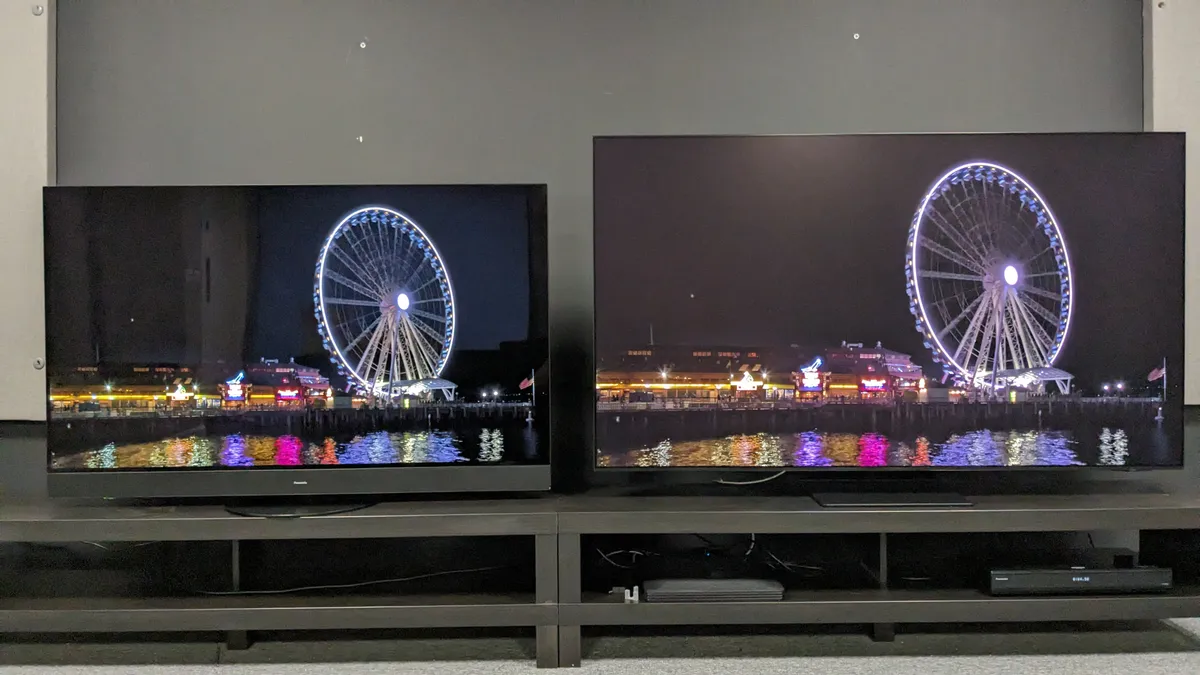
One thing that became apparent when I placed the two TVs side-by-side was the effect of the S95D’s matte screen on black levels. Reflections were reduced, but so too was the depth and richness of the S95D’s blacks compared to the MZ1500. Below is an image from the same Spears & Munsil disc of a bright white Ferris wheel against a black night sky.
Interestingly, the dark tones and contrast were still very good on the S95D, but the picture lacked the MZ1500’s punch. Some shadow detail was missing and it even took on a slightly gray-ish tone. Viewing a scene from The Batman, the overall color palette was different as well, and although that may be down to the TVs themselves (both were in the Movie/Cinema picture mode), I can’t help but wonder if the Samsung TV’s matte screen was at fault.
The Batman looks different on the S95D (right) than on the MZ1500 (left). Could the Samsung TV’s matte screen be responsible? (Image credit: Future)
Viewing both these TVs in pitch-black conditions, eliminating the possibility of reflections altogether, the S95D did have more dynamic color and detail, and its contrast gave the picture incredible depth.
But It’s interesting to note that, in brighter conditions, the MZ1500’s strong contrast gave it the more polished sheen expected from an OLED TV, even if screen reflections were far worse.
(Image credit: Future)
Final thoughts
Although the Panasonic MZ1500 put up a good fight during my comparison with its deep black levels and strong contrast in most lighting conditions in the lab, the Samsung S95D ably demonstrated the effectiveness of its OLED Glare Free screen technology, which converted mirror-like reflections to less distracting haze-type reflections.
For some, screen reflections aren’t an issue, and conventional OLED TVs, generally available for a cheaper price, will continue to be a fine option. But Samsung’s new anti-reflection tech has now made OLED TVs viable for those who view in brighter environments. As a bonus, the Samsung S95D has superb all-around picture quality, which takes OLED TV performance to the next level.
The significant Google Maps redesign we saw a glimpse of back in February has started reappearing on some Android phones, with new refinements added – and it could well be getting a full roll out in the near future.
This has been spotted by 9to5Google, and a lot of the design tweaks are the same. Several of the full screen panels have been changed to show part of the map in the background, giving users some context while they look up different details.
The corners of these panels are now more rounded, and there are easily accessible buttons for closing down or sharing whatever info card is up on screen. The design tested in February also used a stacked approach to the panels, so it looked like they were layered on top of each other, but that has now gone.
Perhaps the biggest change is in getting directions: the fields for the start and end points of the journey now float on top of the map, and the options for changing the mode of transport have been moved down to the bottom of the screen.
Coming soon?
Two examples of the new look in Google Maps (Image credit: Future)
Overall, it means more of the map is visible more of the time – you can click through to 9to5Google to see what some of the changes look like. We’ve seen the updated look appear on our phone, and we’ve included a couple of screenshots above.
Google hasn’t said anything officially about these design tweaks, either now or in February, but as far as we can tell it’s not being rolled out to all devices just yet. The update is applied on the server side, so updating to the latest version of the Android app won’t affect whether or not you see the changes.
Considering this new look has been in testing for several months now, it shouldn’t be too long before everyone sees it on their phones. Presumably Google Maps for iOS will be updated with the same changes at some point too.
Get the hottest deals available in your inbox plus news, reviews, opinion, analysis and more from the TechRadar team.
We’re now just days away from Google I/O 2024, which starts on May 14. There might well be a Google Maps announcement or two at the developer conference, and we’re also expecting to hear about Google’s future AI plans and the Pixel 8a phone.
When choosing a new phone charger today, there is a giddying amount to choose from, and deciding which one is right for you isn’t always straightforward.
Anker is a popular and affordable brand that many opt for, well-regarded for its USB cables and chargers. But there is still an overwhelming number of options even within this one company’s line-up.
Don’t worry, I’ve done the hard work – I tested a load of USB-C chargers, including Anker’s, to see which offer the best value, and I’ve picked out three from Anker I think are great buys, covering different prices and needs. So if you’re after one of the best iPhone chargers or best Android chargers, you’ll be happy with these. They’re all available in both the US and the UK – my pictures are from the UK version, and the designs may be slightly different in the US. Some models are available in Australia, where the design is closer to the US models.
Anker Prime 67W GaN 3-Port Charger
(Image credit: Future)
The Anker Prime 67W is at the premium end of the brand’s wall chargers. It features three ports (two USB-C and one USB-A), which can be used simultaneously to charge devices ranging from phones to laptops, thanks to its maximum of 67W output.
Anker’s PrimeGaN technology claims to offer ultra-fast charging while being more efficient and running at lower temperatures than previous tech. Based on my tests, that seems to be the case. The charging times I experienced via all ports were fast, and while the unit became warm to the touch, it certainly didn’t feel worrying or like a danger.
The build quality is high here, with a durable construction, which is something I found to be common among Anker’s products (I compared them to competitors, too, and Anker’s usually felt better). The pins also fold flat, making it more convenient to travel with, and the hinge mechanism feels tight and precise too.
Anker 323 33W 2-Port USB C Charger
(Image credit: Future)
The Anker 323 is a step down from the Prime in terms of spec, coming with two ports (USB-C and USB-A) instead of three. It also only offers 33W of single-port charging (32W max when using both simultaneously), making it ideal for phones and tablets, as well as low-power laptops, such as the MacBook Air M3.
Get the hottest deals available in your inbox plus news, reviews, opinion, analysis and more from the TechRadar team.
Another difference is that the 323 uses Anker’s PowerIQ 3.0 technology, whereas the Prime uses 4.0. Although both standards offer the same maximum output capacity, IQ4 also features dynamic power distribution, which detects the voltage output of connected devices and makes adjustments accordingly, in order to further optimize charging speeds.
However, during my tests, charging speeds were still fast with the 323, so the difference in real-world terms seems to be negligible in most cases.
As with the Prime, the 323 has a sturdy build and the mechanism of the folding pins feels like it will stand the test of time. The profile is also very small, adding to its pedigree as a travel accessory.
Anker Nano USB-C Charger 30W
(Image credit: Future)
The Anker Nano is one of the most basic chargers the company offers. It has a single USB-C port capable of 30W, so it’s sufficient for smaller devices or a single lightweight laptop.
Like the 323, the Nano utilizes Anker’s PowerIQ 3.0 technology. As with my tests of other products, though, the difference between the 3rd and 4th generation seems marginal in actual applications.
Despite having fewer ports and less power than the 323, the form factor is slightly larger (at least in the UK version that I tested – the US versions have slightly different designs). The color is also slightly off-white – and the faceplate is almost cream or gold in certain lights – so if you’re looking for a charger to match the pristine appeal of Apple’s devices, then you may want to stick with Apple’s own, very similar equivalent to this (though that’s only 20W).
Conclusion
The Anker Prime is the best premium wall charger of the pack, but it may be overkill for some and its relatively high price might put others off as well.
The Nano is at the other end of the spectrum: it offers single-port USB-C charging for your smartphones and tablets, and some laptops. The only luxury is the travel-friendly folding pins. But despite being so spartan, it’s still the same size, if not larger, than wall chargers with more ports.
That’s why I’d choose the Anker 323 instead, which is a great mid-point between the aforementioned Prime and the more basic, single-port competitors in this field.
Whichever one you opt for, though, Anker has a great reputation for making robust, safe and reliable chargers for all kinds of devices and requirements, and that seems to be well deserved from the testing I’ve done.
Las Borinqueñas explores how women sought control of their reproductive lives in the 1950s.Credit: Valerie Terranova
Las Borinqueñas Directed by Rebecca Aparicio Ensemble Studio Theatre, New York City 3 April – 5 May 2024
It’s the 1950s and two US scientists are looking for somewhere to test the first birth-control pill. Where better than Puerto Rico? The territory had an established network of family-planning clinics, and the use of contraception had been legal there since 1937. That wasn’t the case in much of the United States, including Massachusetts, where biologist Gregory Pincus and obstetrician-gynaecologist John Rock were developing the oral contraceptive.
Puerto Rican women were interested in a pill that could give them more control over their reproductive lives. But as they lined up outside a clinic in the outskirts of San Juan to receive the medication, many were unaware that it was an experimental drug and they were part of a clinical trial. When some of them started reporting debilitating side effects, these were dismissed as psychosomatic.
The play Las Borinqueñas, whose title means ‘the Puerto Rican women’, revisits the complicated history of the world’s first oral contraceptive. Mixing the excitement of scientific breakthrough with the shock of flawed research ethics and shadows of colonialism and exploitation, it puts the spotlight on the women who, after playing a key part in the pill’s development, were quickly forgotten.
Reboot contraceptives research — it has been stuck for decades
It’s a long-overdue tribute and, most importantly, a reminder to remain vigilant against abuse and disrespect in studies involving human participants. In a world where the fight for access to birth control is ongoing, it is bold and commendable to recognize that this significant advance was built on ethically problematic studies that harmed some of the very women they aimed to serve and empower.
Written by Nelson Diaz-Marcano, a Puerto Rican theatre-maker based in New York City, the show was developed by the Ensemble Studio Theatre and the Alfred P. Sloan Foundation, a research funder also based in the city. It had its world premiere on 3 April and is playing until 5 May at the Ensemble Studio Theatre in New York City.
Taking control
The play follows the intertwined lives of five women — Chavela, Yolanda, Fernanda, Maria and Rosa — as they cross paths with the researchers testing the pill. As the audience witnesses their love stories, aspirations, struggles and loyal friendships, the protagonists open a window on the lives of hundreds of Puerto Rican women who enrolled in the tests, and how the experience changed them.
Each character is affected in a different way. Chavela sees the trial as chance to slow down the growth of her family while maintaining a passionate marriage. Yolanda envisions it as the lifeline that might save other women from the fate of her sister, Fernanda, who dies as a result of an illegal abortion. For Maria, it’s about avoiding pregnancy to advance her dream of becoming a writer — and about honouring Fernanda, her soulmate, with whom she could never openly have a relationship because of societal norms. But the hope brought on by the pill slowly fades when the women start feeling unwell.
The play shows how researchers and trial facilitators played down side effects because of the pill’s ground-breaking implications.Credit: Valerie Terranova
Rosa, who was suspicious of the pill from the start, urges the others to stop taking it, while boasting about the benefits of the sterilization that she underwent after giving birth. The doctors who suggested the procedure, however, never told her it was irreversible. The heartbreaking scene when she learns she will never be able to have another baby signals that the clinical trial wasn’t the first instance of medical abuse these women endured. By 1953, a eugenics-based programme in Puerto Rico had led to the sterilization of nearly one-fifth of women on the island to address concerns about ‘surplus population’.
From rabbits to women
The birth-control pill was the result of the encounter of Pincus and Rock, who were both studying the effects of synthetic progesterone, but in different contexts. Pincus was looking into the anti-ovulatory effect of the hormone in rabbits, and Rock was exploring it as a means to treat his patients’ infertility. The play focuses on Pincus, portrayed as an ambitious scientist determined to carve his name into history by creating a revolutionary product.
I wouldn’t be a scientist without my abortion
When someone becomes pregnant, their levels of progesterone go up, signalling to the body to shut down the ovaries and not release new eggs. Whereas Pincus wanted to mimic this process for the purpose of contraception, Rock hoped that a pause in ovulation would allow his patients’ reproductive systems to reset, increasing their chances of pregnancy after the treatment.
The scientists came together to test the pill in humans. The play briefly refers to a couple of small trials done in the United States, but to get the pill approved, it had to be tested on a larger scale. Pincus sets his sights on Puerto Rico and seeks to partner with Edris Rice-Wray, who was then the medical director of the Family Planning Association of Puerto Rico.
Rice-Wray expresses her concerns about negative side effects that had been observed in previous tests, but is convinced to join the project by Pincus’s wife, who highlights the potentially revolutionary implications of the pill for women around the world.
Rice-Wray is portrayed as a responsible public-health official who is nonetheless persuaded to push the boundaries of ethics for the greater good. She launches the programme with fanfare in 1956 and, at the suggestion of Pincus, does not mention the potential side effects to participants, most of whom are poor women with little access to health care. Her discomfort with the omission increases as she hears that the trial is taking a toll on participants.
Are women in research being led up the garden path?
In one scene, Chavela is taking laundry from the line when she is struck by dizziness and nausea. Her sister Rosa warns her that the pill is to blame, but she prefers to continue taking it rather than to risk becoming pregnant again. Rice-Wray reports those concerns to Pincus, who minimizes them as minor inconveniences compared with the wider benefits of the drug. Because of his disregard for the Puerto Rican study participants, the real-life Pincus was later accused of colonialism and exploitation of women of colour.
The protagonists eventually stop taking the pill and don’t experience long-term consequences. But the play mentions that three Puerto Rican women died during the trial, and that their deaths were never investigated.
Trial and error
In reality, of around 800 women who enrolled in the study, only 130 took the pill for a year or more, most dropping out because of the side effects. To make the results look more impressive, Pincus described them by saying that no pregnancy had been registered “in the 1,279 menstrual cycles” during which the treatment had been followed. In the play, his character brushes off the accusation of data embellishment. For him, it was simply a matter of using a different metric.
The pill, branded as Enovid, went on to be approved by the US Food and Drug Administration as a contraceptive in 1960. The participants of the clinical trial didn’t have access to the product once it reached the market: the price was prohibitive for the Puerto Rican working class.
How centuries of sexism excluded women from science — and how to redress the balance
More than six decades later, the contraceptive pills available are much safer. But access is still an issue. In the United States, until last year, people still needed a prescription to buy oral contraceptives — a significant barrier for those without health insurance.
Las Borinqueñas concludes with the women refusing to be defined by the experience of being exploited by scientists and having their right to decide about their own reproductive lives stripped away. Rosa publicly denounces the pill’s side effects and the irreversibility of sterilization on a radio show; she also conveys her resilience and hope for the future. The women will continue to take care of their families, to work and to pursue their dreams. They celebrate life and laugh at adversity.
Some would argue that their suffering was a small price to pay for the wider impacts of pill. But by giving names to the study participants and telling their stories, Las Borinqueñas serves as a powerful reminder that such disregard and injustice was never acceptable.
Google‘s Long Exposure photo mode is actually decent. There, I said it. Photographer me is putting his neck on the line by saying that another smartphone computational photography mode, recently given its own tab in Google’s revamped Camera app, is one less reason to use a ‘proper’ camera – and mine’s a TechRadar-approved best mirrorless camera, no less.
I was on a short family break at the coast recently and set an early alarm to sneak out for a little solo time at first light at a secluded cove nearby. It would be me, the gentle lapping waves, and hopefully a little color in the sky. Of course, I would take a camera too.
Hot tea in a travel flask, banana, notepad and pen, mirrorless camera, two pro lenses covering the 24-200mm focal length between them, an ND filter plus a tripod, and I was good to go. Oh, and the Google Pixel 6 was in my pocket.
Image 1 of 3
The standard version of the headline image, completely unedited.(Image credit: Future | Tim Coleman)
With the Long Exposure photo mode applied but no edit. That horizon needs straightening!(Image credit: Future | Tim Coleman)
An edited version in the original 4:3 aspect ratio, whereas our headline images get cropped 16:9.(Image credit: Future | Tim Coleman)
A steep descent through a wooded area and the sheltered east-facing cove came into view. I’ve learned the importance of enjoying nature first before taking a camera out of the bag, especially given my screen-intensive day job.
After grounding myself in the peace and unrushed pace of the quiet sunrise I started moving around the beach looking for compositions that caught my eye, for photos that would transport me back to what it was like being there.
Sunrise was lovely – not award-winning, but adding a splash of color. The outgoing tide was steadily revealing more of the beach. Small waves crashed against the clay-red sandy incline, climbed up the beach a little, and then retreated around small rocks, creating interesting patterns.
Get the hottest deals available in your inbox plus news, reviews, opinion, analysis and more from the TechRadar team.
I’ve taken a few long exposure seascape photos down the years, and love the technique, especially for accentuating the movement of water as it retreats around rocks. I take a quick snap of the scene on the Pixel 6 and it occurs to me that I’ve not properly used its Long Exposure photo mode yet, now prominent in the camera app with its own tab.
Image 1 of 2
Most of my favorite images of the morning were taken in vertical format. I’ve made a cooler, moody edit to this photo using the Google Pixel 6’s camera app editor (Image credit: Future | Tim Coleman)
The unedited standard version of the same image. (Image credit: Future | Tim Coleman)
The Long Exposure photo mode blurs movement, while keeping still objects sharp. The creative technique can be used in several ways, with blurring moving water a popular choice. Having observed the water trails, I line up the picture and take the snap.
It works a little like Night Sight – you need to keep your phone as steady as possible while the long exposure is captured. That way the still objects – in this case the rocks, cliff faces, and untouched sand – remain sharp. This computational photography mode is like a pro mirrorless camera’s in-body image stabilization on steroids.
The phone stores both the regular photo and the long exposure effect image (I’ve included both versions of every image for comparison). I have to say, the effect in this scenario is convincing (see above), similar to what I’d expect from my mirrorless camera which remains in the bag 50 meters away up the beach.
Whatever camera you use for long exposure photography (be it mirrorless or a cameraphone) – in this context of accentuating retreating ocean waters – you need to keep trying and trying and trying to get the shot. Timing is so hard.
Your best bet is starting the capture with the wave at its peak up the beach and just as the water starts to retreat. That way the natural path back to the ocean, be it straight or snaking around rocks, is accentuated and depicts the tidal energy.
Image 1 of 2
Not all scenes are worth using the Long Exposure photo mode for. The water is too far away in this composition and now I’m blowing out highlights.(Image credit: Future | Tim Coleman)
For this scene I prefer the standard photo. Also, if you look closely at the detail in the image using the Long Exposure photo mode, it’s a little softer.(Image credit: Future | Tim Coleman)
Google Pixel’s Long Exposure mode isn’t perfect – detail is usually softer than in the standard version – but it’s pretty darn good and convincing enough that I didn’t really need to bring my mirrorless camera, tripod, and ND filters along for the ride. If I owned the OM System OM-1 II (or OM-1), I could use that camera’s Live ND computational photography mode instead and leave the tripod and ND filters behind.
I haven’t lost faith in my ‘proper’ camera, far from it. Towards the end of my time at the beach, while still alone, a playful seal popped its head up like a floating rock. I steamed back up the beach to my bag, grabbed the camera with a 70-200mm lens, and got a few photos that far exceed what I could possibly hope to get with the Pixel 6 – though some of today’s best cameraphones might have done a decent job.
I’ll also still use my ‘proper’ camera with tripod and ND filters for long exposure photography, too. It’s just that now I might think twice if lugging all of that gear to get the creative effect is worth it when I have the computational mode in a device that slips into my pocket.
Sammy, from considerable distance, taken with my pro mirrorless camera that I still love. (Image credit: Future | Tim Coleman)
LG’s smart TV platform, webOS, has been a mainstay feature on its TVs and continues to evolve every year. It’s easily one of the best smart TV platforms out there, but hasn’t been without its share of criticisms in the past.
Last year’s version, webOS 23, featured on some of the best TVs on the market, including the LG C3, LG G3 and LG B3. We frequently praised it for its level of customization, its ease of navigation thanks to its new Quick Cards and quick menu, and its overall layout. Overall, it was a big improvement over webOS 22.
I’ve recently been testing one of LG’s latest mini-LED TVs for 2024, the LG QNED91T, and this comes installed with the latest version of webOS, webOS 24 – which will also be available on the LG C4 and LG G4 along with the rest of the range. While on the surface it may not seem like much has changed, there are some new features and upgrades that have been introduced and improved on that makes this arguably the best smart TV platform I’ve used in several years of both reviewing TVs and working in TV retail. Here are the three features that really jumped out to me.
1. A neater, toned down layout
Further down the home page on webOS 24 (pictured) shows a tidier and easier to navigate layout. (Image credit: Future)
Although a simple change, webOS 24’s home screen layout and appearance is easily one of its best features. Last year, webOS 23 improved greatly on webOS 22’s cluttered ad and recommendation-heavy home screen in a big way, and webOS 24 has taken this a step further.
Quick Cards, an addition to webOS 23 last year, collects any apps relevant into its category such as Game, Sport (more on that below), Music and more. So, for example, the Game quick card collects all the cloud based gaming services that webOS is compatible with such as Nvidia GeForce Now, Luna, Utomix and so on. In webOS 24, these cards have taken an even more slimmed down appearance on the home page and have become even more intuitive.
As you scroll down the home page, rather than being confronted with tons of ads and recommendations, you’re now met with a leaner set of menus. LG has opted for a more simple approach, such as the Now Streaming section in the picture above, which rather than spreading out every individual streaming service to its own line has collated them with a side-scrolling option to the relevant service you want.
If you use broadcast TV, there’s also a live TV guide that shows what’s live now, a Life’s Good Hub with LG recommendations and more. But if you don’t want these on your home menu, you can simply remove them, leaving you with a compact home menu that simply shows your favorite apps.
2. Sports quick card and My Team
The My Team section of the Sport Quick Card (pictured) in webOS 24 is very useful for sports fans, like myself. (Image credit: Future)
For a sports fan like myself, the sport quick card has undergone some changes and includes a feature called My Team. In this, you can select your favorite team from a fairly extensive list and it’ll keep track of live score, a team’s schedule, recent results and even relevant videos.
Admittedly, as a rugby fan, there weren’t many options, but there were plenty of other options to choose from and LG covered its bases well with soccer teams from major leagues including the Premier League, Serie A, La Liga, and more. There was also extensive coverage of the MLB, NBA, NFL and NHL as well.
As a fairly new (and still somewhat casual) baseball fan, keeping track of the 162 regular season games can be daunting. So, I tested webOS 24 by choosing my favorite baseball team, the Toronto Blue Jays, in My Team. Immediately, I was shown all the Blue Jays’ recent scores and games and their upcoming schedule. I was even shown that I could stream one of the upcoming games on Prime Video, in its Discovery Plus add-on – something I didn’t know.
The main home page of the sports quick card takes on a broader approach and still includes popular video such as Premier League highlights and headline scores for those interested in multiple sports and combined with the My Team feature, this was one of my favorite webOS 24 features.
3. Improved accessibility features
The Accessibility Quick Card allows users direct access to accessibility features if they need them and even previews what users are getting. (Image credit: Future)
More TV brands are starting to go to great lengths to make TV accessible for everyone, via voice assist, audio description, subtitles and so on. In webOS 24, LG has introduced an accessibility Quick Card, meaning it’s easy for those who need these features to access them, because it sits front and center on the home page. In the past, these accessibility features were often, and still are in some cases, buried in settings screens.
On this accessibility Quick Card, these accessibility features are not only easy to access, but do a great job of demonstrating just what the user is getting. Something as simple as a visual demonstration of what subtitles turned on will look like on screen (as shown in the photo below) is a further step to make things easier for the user.
Finally, there’s the introduction of the AI chatbot. This tool is designed to assist in issues users may be experiencing with the TV such as the screen being too dark, sound being too quiet and so on, and assist where possible. It can be used via voice command or on-screen with inputs from the remote. It’s certainly a useful feature that, while it may not be the most extensive, will certainly aid some users having basic issues and not knowing where to start with fixing them, and will no doubt be improved in further updates.
Much like the ubiquitous Instant Pot that trended before them, air fryers can be a useful addition to your kitchen. While they excel at making things super crispy without excess oil, many of them are true multicookers with different cooking modes like bake, broil and dehydrate. Regardless of if you get a traditional pod-style air fryer or a larger air fryer toaster oven machine, there’s a good chance you’ll be able to use your new appliance for more than just crisping up chicken or french fries. If you’re still on the fence about buying one, or don’t know where to start looking for the best air fryer for you, we at Engadget can help. We’ve detailed our top picks below, along with buying advice that will help you decide which air fryer model is right for you.
What does an air fryer do?
Let’s clear one thing up first: it’s not frying. Not really. Air fryers are more like smaller convection ovens, ones that are often pod-shaped. Most work by combining a heating element and fan, which means the hot air can usually better crisp the outside of food than other methods. They often reach higher top temperatures than toaster ovens – which is part of the appeal.
For most recipes, a thin layer of oil (usually sprayed) helps to replicate that fried look and feel better. However, it will rarely taste precisely like the deep-fried version. Don’t let that put you off, though, because the air fryer, in its many forms, combines some of the best parts of other cooking processes and brings them together into an energy-efficient way of cooking dinner. Or breakfast. Or lunch.
You probably know the “Instant” brand from the line of very popular Instant Pot pressure cookers, but did you know that the company makes great air fryers too? We’re especially impressed by the Instant Vortex Plus with ClearCook and OdorErase, which features a clear viewing window so you can see the air fry basket while your food is cooking, plus an odor-removing filter. In our testing, we found that it didn’t completely eliminate smells, but it seemed significantly less smoky when compared to our Breville Smart Oven Air. We love its ease of use intuitive controls, the easy-to-clean nonstick drawer basket, plus the roomy interior – it’s big enough to fit four chicken thighs. Plus, this top pick heats up very quickly with virtually no preheating time.
A slightly more affordable option is its predecessor, the Instant Vortex Plus 6-Quart. It lacks the viewing window and the odor-removing filters, but it still has the same intuitive control panel and roomy nonstick interior. If you want an even bigger option, Instant also offers Instant Vortex Plus in a 10-quart model that has a viewing window and a rotisserie feature.
Pros
ClearCook window lets you see your food as it cooks
Capacity: Up to 10-quart | Type: Pod-shaped | Cooking functions: Fry, broil, roast, bake, reheat, dehydrate | Weight: 19.80 lb
Most machines can make one thing at a time, but Ninja’s Dual Zone digital air fryer can handle two totally different foods simultaneously. Available in 8- and 10-quart capacities, this dual-basket air fryer isn’t compact, so it won’t be a good option for those with small kitchens. However, if you have the counter space, it could be the best air fryer to invest in especially if you cook for a large family. You can prep two totally different foods, like chicken tenders and brownies, at the same time with totally different cooking modes, or use Match Cook to prepare foods in the dual baskets the same way. The heating zones are independent, so if you only want to fill up one side with french fries and leave the other empty, you can do that as well.
We appreciate how quickly the Ninja air fryer heats up (there’s little to no preheating time at all) and how it runs relatively quietly. It also has a feature called Smart Finish that will automatically adjust cooking times so that your fried chicken thighs in the first chamber and asparagus in the second will finish at the same time, so you don’t have to wait for one part of your meal to be ready while the other gets cold. In general, dual-zone air frying capabilities aren’t necessary for most people, but those who cook often will get a lot of use out of machines like the Ninja Foodi.
Pros
Two separate chambers for cooking different foods
Smart Finish feature adjusts cooking times so foods finish simultaneously
Not only is the Instant Vortex Mini budget-friendly with a $60 price tag (and you can often find it on sale for less), but it’s also the best small air fryer on this list. Most air fryers will take up a lot of precious countertop space, but this two-quart model is great for those who don’t have a lot to spare. The Vortex Mini can air fry, bake, roast and reheat, and you can control the temperature and cook time using the dial sitting in the middle of its touchscreen. Unlike some of the other, more expensive air fryers we tested, which have a variety of modes and settings, the Vortex Mini is dead simple to use. Just plug it in, press the preset cooking method of your choice, customize the temperature and cook time and press Start. The machine will beep about halfway through the cycle to let you know when to flip your food, and it’ll chime again once it’s finished.
Arguably the biggest caveat to the Vortex Mini is also its biggest strength. It’s so compact that cooking more than one thing, or a lot of one thing, won’t be easy. But I was able to cook a whole block of tofu cut into cubes (with a bit of overlap) and reheat (and re-crisp) leftovers in it for myself and my fiancé with no problems. Overall, this compact air fryer will be hard to beat for those with tight budgets and tiny kitchens.
Listen, most people don’t need the Breville Smart Oven Air Fryer Pro. But if you love to cook, have a large family or throw a bunch of parties, you’ll likely get a ton of use out of this machine. This stainless steel countertop oven is a beast, measuring one cubic foot, so be prepared to carve out some space in your kitchen for it. But its size allows it to cook an entire 14-pound turkey and fit things like a five-quart dutch oven and a 9 x 13 pan inside of it. This large air fryer basically acts like a second oven, or even a primary one if your main oven is out of commission.
As the best air fryer toaster oven on this list, it’s quite capable and its size helps since you can spread your food out to ensure things are as crispy as possible. It also helps that you can cook a lot of servings at once, which will make it easier if you’re preparing snacks like bagels for brunch, appetizers for a party or a side dish for a family dinner. In addition to air frying, it has a number of other cooking modes including toast, broil, bake, pizza, dehydrate, slow cook and proof. Despite the “smart” moniker, this model doesn’t have app connectivity – but you can get that feature if you upgrade to the Joule. That’ll allow you to get push notifications when your food’s ready, and the companion app also has guided recipes which you can follow along with. Unsurprisingly, like most Breville gadgets, both the Joule and the standard Smart Oven Air Fryer Pro are quite expensive, coming in at $500 and $400, respectively. But if you’re looking to add the versatility of a multi-use machine to your kitchen, Breville has you covered.
You can separate most air fryers into two types and each has different pros and cons. Convection ovens are usually ovens with air fryer functions and features. They might have higher temperature settings to ensure that food crisps and cooks more like actually fried food. Most convection ovens are larger than dedicated air fryers, defeating some of the purpose of those looking to shrink cooking appliance surface area. Still, they are often more versatile with multiple cooking functions, and most have finer controls for temperatures, timings and even fan speed.
You may never need a built-in oven if you have a decent convection oven. They often have the volume to handle roasts, entire chickens or tray bakes, and simply cook more, capacity-wise, making them more versatile than the pod-shaped competition.
The flip side of that is that you’ll need counter space in the kitchen to house them. It also means you can use traditional oven accessories, like baking trays or cake tins, that you might already own.
Pod-shaped air fryers
Pod-shaped air fryersare what you imagine when you think “air fryer.” They look like a cool, space-age kitchen gadget, bigger than a kettle but smaller than a toaster oven. Many use a drawer to hold ingredients while cooking, usually a mesh sheet or a more solid, non-stick tray with holes to allow the hot air to circulate. With a few exceptions, most require you to open the drawer while things cook and flip or shake half-cooked items to ensure the even distribution of heat and airflow to everything.
That’s one of a few caveats. Most pod-shaped air fryers – there are a few exceptions – don’t have a window to see how things are cooking, so you’ll need to closely scrutinize things as they cook, opening the device to check progress. Basket-style air fryers also generally use less energy – there’s less space to heat – and many have parts that can be put directly into a dishwasher.
Some of the larger pod-shaped air fryers offer two separate compartments, which is especially useful for anyone planning to cook an entire meal with the appliance. You could cook a couple of tasty chicken wings or tenders while simultaneously rustling up enough frozen fries or veggies for everyone. Naturally, those options take up more space, and they’re usually heavy enough to stop you from storing them in cupboards or shelves elsewhere.
As mentioned earlier, you might have to buy extra things to make these pod fryers work the way you want them to. Some of the bigger manufacturers, like Philips and Ninja, offer convenient additions, but you’ll have to pay for them.
Air fryer pros and cons
Beyond the strengths and weaknesses of individual models, air fryers are pretty easy to use from the outset. Most models come with a convenient cooking time booklet covering most of the major foods you’ll be air frying, so even beginners can master these machines.
One of the early selling points is the ability to cook fries, wings, frozen foods and other delights with less fat than other methods like deep frying, which gets foods the crispiest. As air fryers work by circulating heated air, the trays and cooking plates have holes that can also let oil and fat drain out of meats, meaning less fat and crisper food when you finally plate things up. For most cooking situations, you will likely need to lightly spray food with vegetable oil. If you don’t, there’s the chance that things will burn or char. The oil will keep things moist on the surface, and we advise refreshing things with a dash of oil spray when you turn items during cooking.
Most air fryers are easy to clean – especially in comparison to a shallow or deep fryer. We’ll get into cleaning guidance a little later.
With a smaller space to heat, air fryers are generally more energy-efficient for cooking food than larger appliances like ovens. And if you don’t have an oven, air fryers are much more affordable – especially the pod options.
There are, however, some drawbacks. While air fryers are easy enough to use, they take time to master. You will adjust cooking times for even the simplest types of food – like chicken nuggets, frozen French fries or brussels sprouts. If you’re the kind of person that loves to find inspiration from the internet, in our experience, you can pretty much throw their timings out of the window. There are a lot of air fryer options, and factors like how fast they heat and how well distributed that heat is can – and will – affect cooking.
There’s also a space limitation to air fryers. This is not a TARDIS – there’s simply less space than most traditional ovens and many deep fat fryers. If you have a bigger family, you’ll probably want to go for a large capacity air fryer – possibly one that has multiple cooking areas. You also might want to consider a different kitchen appliance, like a multicooker, sous vide or slow cooker to meet your specific cooking needs.
You may also struggle to cook many items through as the heat settings will cook the surface of dishes long before it’s cooked right through. If you’re planning to cook a whole chicken or a roast, please get a meat thermometer!
Best air fryer accessories
Beyond official accessories from the manufacturer, try to pick up silicone-tipped tools. Tongs are ideal, as is a silicon spatula to gently loosen food that might get stuck on the sides of the air fryer. These silicone mats will also help stop things from sticking to the wire racks on some air fryers. They have holes to ensure the heated air is still able to circulate around the food.
Silicone trivets are also useful for resting any cooked food on while you sort out the rest of the meal. And if you find yourself needing oil spray, but don’t feel like repeatedly buying tiny bottles, you can decant your favorite vegetable oil into a permanent mister like this.
How to clean an air fryer
We’re keeping clean up simple here. Yes, you could use power cleaners from the grocery store, they could damage the surface of your air fryer. Likewise, metal scourers or brushes could strip away the non-stick coating. Remember to unplug the device and let it cool completely.
Remove the trays, baskets and everything else from inside. If the manufacturer says the parts are dishwasher safe – and you have a dishwasher – the job is pretty much done.
Otherwise, hand wash each part in a mixture of warm water, with a splash of Dawn or another strong dish soap. Use a soft-bristled brush to pull away any crumbs, greasy deposits or bits of food stuck to any surfaces. Remember to rinse everything. Otherwise, your next batch of wings could have a mild Dawn aftertaste. Trust us.
Take a microfiber cloth and tackle the outer parts and handles that might also get a little messy after repeated uses. This is especially useful for oven-style air fryers – use the cloth to wipe down the inner sides.
If Dawn isn’t shifting oily stains, try mixing a small amount of baking soda with enough water to make a paste, and apply that so that it doesn’t seep into any electrical parts or the heating element. Leave it to work for a few seconds before using a damp cloth to pull any greasy spots away. Rinse out the cloth and wipe everything down again, and you should be ready for the next time you need to air fry.
How to find air fryer recipes
Beyond fries, nuggets and – a revelation – frozen gyoza, there are a few ways to find recipes for air-fried foods. First, we found that the air fryer instruction manuals often have cooking guides and recipe suggestions for you to test out in your new kitchen gadget. The good thing with these is that they were made for your air fryer model, meaning success should be all but guaranteed. They are often a little unimaginative, however.
Many of the top recipe sites and portals have no shortage of air fryer recipes, and there’s no harm in googling your favorite cuisine and adding the words “air fryer” on the end of the search string. We’ve picked up some reliable options from Delish, which also has a handy air fryer time converter for changing oven and traditional fryer recipes.
BBC Good Food is also worth browsing for some simple ideas, as is NYT Cooking, with the ability to directly search for air fryer suggestions.
And if you have a killer recipe or unique use for your air fryer, let us know in the comments. What’s the air fryer equivalent of the Instant Pot cheesecake? We’re ready to try it.
I’ve been coveringhearing aids for WIRED for nearly three years now, and I regularly talk to users and prospects about them when I wear them in public. Regardless of what I’m testing, one brand name has consistently and repeatedly popped up during that time: Jabra.
The Danish brand has a long history making a variety of audio gear, but I’ve always associated it mostly with the Bluetooth headset craze of the aughts. The brand made an early entrance into the over-the-counter hearing aid market (via an acquisition), and it hasn’t let up since, releasing new OTC models at a steady clip.
The latest of these is the Jabra Enhance Select 300, the brand’s smallest and most advanced model yet. You wouldn’t really know it just from the look of the aids. These are fairly standard behind-the-ear models that, while quite small (2.64 grams each), don’t offer any obvious surprises. The demure gray chassis sits close to the back of the ear and snakes a silver cable to the ear canal. Each aid carries a single button on its reverse.
Photograph: Jabra Enhance
Jabra front-loads a lot of the purchase process to ensure your aids arrive preconfigured. You can take an online hearing test or, as I did, upload a professional audiogram; either option allows Jabra’s audiologists to tune the product appropriately before it is shipped. The company also asks you to take a lengthy medical questionnaire to rule out any hearing-related medical problems before sending out the product. Eventually, the digital chatter can get a little tiresome: During the shopping process, Jabra even asks about your credit rating and suggests a monthly payment plan for its lowest-priced product if you say your credit is trash. Once you do place an order, Jabra barrages you with introductory emails and invites you to schedule an orientation with an audiologist to walk you through the hardware and the app. Admittedly, some of this is helpful—especially the Zoom orientation—but Jabra could stand to pump the breaks on the auto-mailer a bit.
There’s plenty to explore once your hearing aids arrive. For example, if you aren’t sure which type of ear tips are best for you, you’ll have ample room to experiment, because the company sends seven different baggies of them to try out, including open, closed, and tulip-style tips in a multitude of sizes. I counted 70 different tips in total, and I have no doubt that Jabra would happily send more if I asked.
With tips installed (I usually test with open tips), I found that getting the aids situated on my ears was made a bit easier thanks to a pinging sound that plays—Jabra calls it Smart Start—while you are guiding the receivers into your ear canal. Controls are as basic as they come: the button on the right aid turns the volume up for both aids, the one on the left turns volume down, and either one cycles through the programs—four in total—if you hold it down for a couple of seconds.
Naturally you’ll get a lot more out of the hearing aids if you connect your set to a mobile app, and Jabra actually has two apps to choose from. The Enhance Pro app comes up first in the app store, but the Enhance Select app is newer. They work about the same way, but since the Enhance Select is more recent I’ll write mostly about it. Primarily you’ll use the app to move among the four modes—All Around, Restaurant, Music, and Outdoor—all of which are self-explanatory. Each mode has extra options associated with it; for most you can select between “noise filter” to mute ambient sounds or “speech clarity” to boost conversational volume. These can be further customized thanks to three equalizer sliders corresponding to bass, middle, and treble frequencies. Volume can be set globally or individually per ear in the app as well. Of special note: Any customizations you make to programs aside from the All Around mode are reset to defaults once the hearing aids are put back into the charging case.
Comino, known for its liquid-cooled servers, has finally released its new flagship for testing.
The Comino Grando Server has been designed to meet a broad spectrum of high-performance computing needs, ranging from data analytics to gaming.
In a comprehensive test by StorageReview, the Grando Server, alongside a Grando Workstation variation, was put through a series of rigorous benchmarks including Blender 4.0, Luxmark, OctaneBench, Blackmagic RAW Speed Test, 7-zip Compression, and Y-Cruncher.
(Image credit: Comino)
The server, equipped with six Nvidia RTX 4090s, AMD‘s Threadripper PRO 5995WX CPU, 512GB DDR5 DRAM, a 2TB NVMe SSD, and four 1600W PSUs, delivered impressive results, as you’d expect from those specifications.
Grando Server features advanced liquid cooling, allowing it to accommodate those six Nvidia 4090 GPUs side by side, a setup that Lyle Smith from StorageReview noted would be impossible with air cooling.
GPU-driven performance systems done right
The main difference between the Grando Server and Grando Workstation lies in their GPU and CPU capabilities. With its higher core count, the Server model is well-suited for parallel processing tasks. While still powerful, the Workstation offers fewer cores and is better suited for balanced performance across various applications.
The Grando Workstation that Smith tested featured four Nvidia A100 professional GPUs, a Threadripper Pro 3975WX processor, 512GB DDR5 DRAM, and a 2TB NVMe SSD.
In his review, Smith found the Comino Grando Server and Workstation to be “prime examples of GPU-driven performance systems done right.”
He said, “Performance-wise, the benchmark results paint a clear picture: the Grando Server excels in GPU-intensive tests like OctaneBench and Blender 4.0, highlighting its capability to breeze through high-end rendering jobs. With its tailored CPU-GPU balance, the Workstation version offers versatility for various professional applications. The speed and efficiency of both systems in managing large datasets, as evidenced by the 7-zip Compression and Y-Cruncher benchmarks, underscore their capacity for handling data-intensive operations, a critical advantage in today’s data-driven landscape.”
StorageReview approved of the Comino Grando systems so much that it rated them one of its “Best of 2024” award winners.
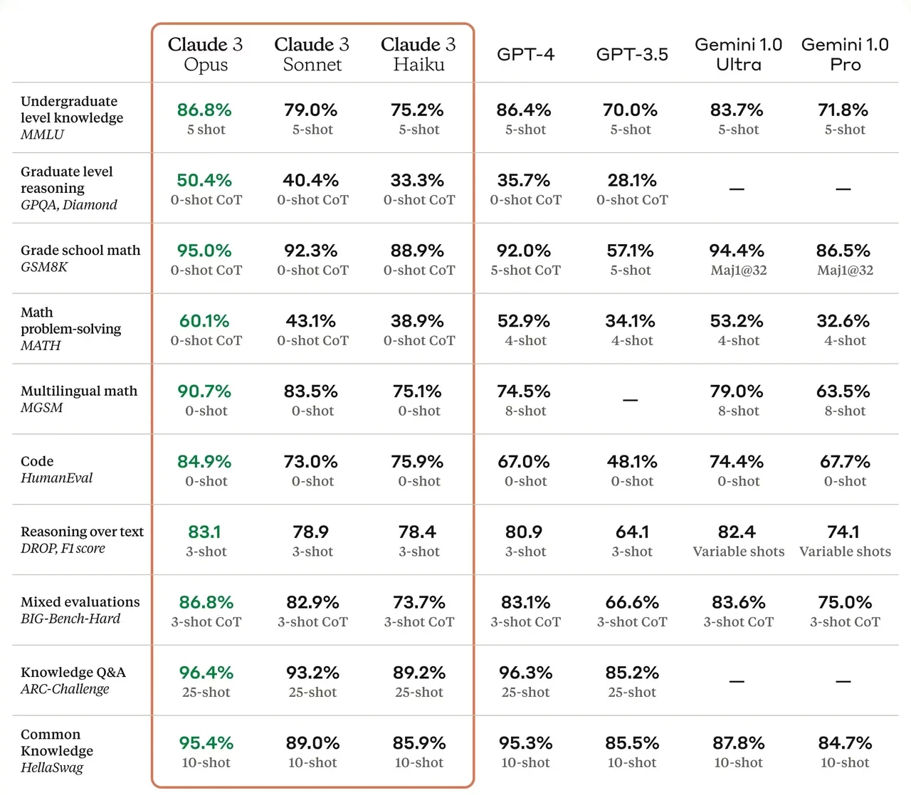
Earlier this week Anthropic surprise the AI community by releasing three new AI models making up the Claude 3 family. The three different-sized models: Haiku, Sonnet, and Opus are vision language models (VLMs), capable of processing both text and images. If you’re interested in learning more about the performance of the Claude 3 API Opus AI model you’re sure to be interested in the results comparison video created by the All About AI YouTube channel. Providing an overview of what you can expect.
Let’s start with the highlights. Claude 3 API Opus LLM has been tested on a variety of tasks that are crucial for today’s software applications. It’s shown remarkable skill in logical reasoning, handling complex, multi-step problems with what seems like ease. This suggests that it’s well-equipped for tasks that require deep, intricate thinking.
Claude 3 API Opus LLM performance tested
When it comes to coding, this model is quite the performer. It’s been tested on its ability to understand and generate Python code, animate data like Bitcoin price fluctuations, and even build functional websites from scratch. These are no small feats, and they point to the model’s potential as a valuable tool for developers, helping to speed up and streamline programming work.
Claude 3 Opus is Anthropic’s most intelligent model, with best-in-market performance on highly complex tasks. It can navigate open-ended prompts and sight-unseen scenarios with remarkable fluency and human-like understanding. Opus shows us the outer limits of what’s possible with generative AI. However, it’s not all smooth sailing. The model hit a few snags, particularly when it came to following complex system instructions that involved embedding hidden messages within sentences. This indicates that there’s room for improvement, and it’s an area that could benefit from additional training or algorithm adjustments.
Potential uses of Opus :
Task automation: plan and execute complex actions across APIs and databases, interactive coding
R&D: research review, brainstorming and hypothesis generation, drug discovery
Strategy: advanced analysis of charts & graphs, financials and market trends, forecasting
Now, let’s talk about image analysis. The model was tasked with generating a Bitcoin price prediction for the year 2024, and it did so by creating a detailed graph. Although the prediction was a bit too optimistic, the ability of the model to turn visual information into a detailed report is noteworthy.
So, what does all this mean for you? If you’re in the field of software development or data analysis, Claude 3 API Opus LLM could be a powerful asset. Its strengths in logical reasoning and coding are clear, and its image analysis capabilities are promising. While it does have some areas that need refining—like its handling of advanced system instructions—the overall performance is a strong indicator of its potential to make a significant impact on API projects and beyond.
As we continue to push the boundaries of AI technology, it’s exciting to think about the improvements that lie ahead for models like Claude 3 API Opus LLM. With further development, it’s poised to become an even more valuable resource for the tech industry. So, keep an eye on this space, because the future of AI is unfolding right before our eyes, and it’s sure to bring some fascinating developments.
Filed Under: Technology News, Top News
Latest Geeky Gadgets Deals
Disclosure: Some of our articles include affiliate links. If you buy something through one of these links, Geeky Gadgets may earn an affiliate commission. Learn about our Disclosure Policy.