Categories
News

Creative Live! Meet 4K web camera €350

Creative Live Meet 4K webcamera

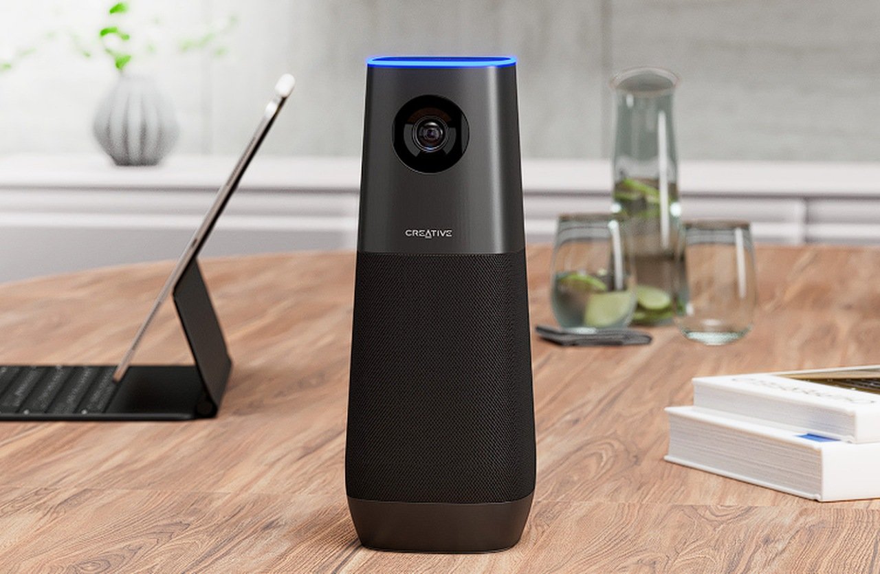
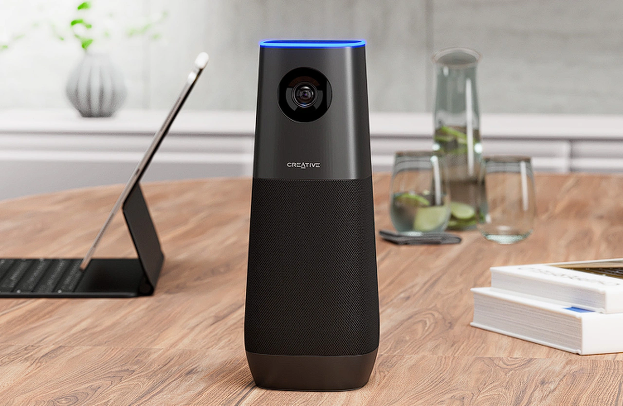
The Creative Live! Meet 4K web camera is designed to enhance the quality of virtual interactions, whether they be formal meetings, educational classes, or recreational activities. The Meet 4K web camera is equipped with a host of advanced features that collectively deliver a superior video conferencing experience.

One of the standout features is its 4K UHD resolution, powered by a cutting-edge Sony STARVIS IMX415 CMOS imaging sensor. This combination ensures vivid, detailed visuals that bring a new level of clarity to virtual interactions. The high-definition resolution, coupled with the advanced imaging sensor, provides a level of detail and color accuracy that is truly remarkable.

Equally impressive is the webcam’s wide-angle field of view. With up to 115° of coverage, the Creative Live! Meet 4K web camera is ideal for large meetings or presentations, ensuring all participants are clearly visible. This broad field of view is complemented by an adjustable digital zoom feature, which allows users to focus on important details without compromising image quality. With 7X digital zoom, users can highlight key points or individuals, adding another layer of versatility to the device.

4K web camera

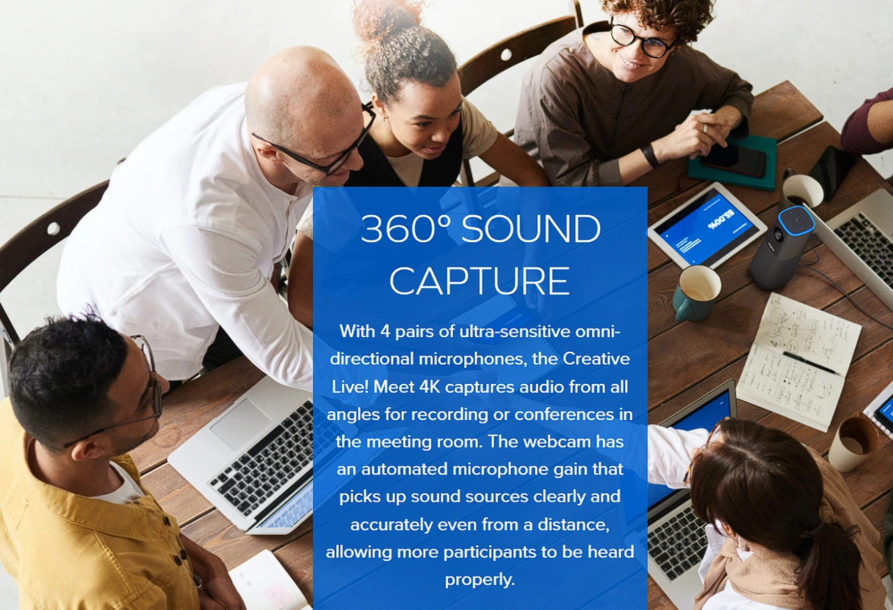
The Creative Live! Meet 4K web camera doesn’t compromise on audio quality either. It features four pairs of ultra-sensitive omni-directional microphones that provide comprehensive audio capture. This is further enhanced by an automated microphone gain that picks up sound from a distance, ensuring clear audio from all participants, regardless of their location. The inclusion of 40 mm Neodymium magnet speaker drivers further bolsters audio clarity and depth, providing a rich, immersive audio experience.

Creative 4K web camera

Other articles we have written that you may find of interest on the subject of web cameras :

In addition to its impressive visual and audio capabilities, the Creative Live! Meet 4K web camera boasts built-in AI tracking and framing technology. This feature uses facial recognition to keep the subject centered in the frame, eliminating the need for manual adjustments and ensuring the speaker is always the focus of attention. The webcam also responds to hand gestures, allowing users to trigger specific actions with a simple wave of the hand.

The user-friendly design of the Creative Live! Meet 4K web camera extends to its setup and operation. The device requires no additional driver installation and is compatible with both Windows and macOS platforms. It also includes a remote control and mic mute button for easy adjustments during conversations.

Moreover, users can access smart communication features such as VoiceDetect and NoiseClean-Out through the Creative App’s SmartComms Kit. These features further enhance the device’s functionality, making the Creative Live! Meet 4K web camera a comprehensive solution for all virtual conferencing needs.

The Creative Live! Meet 4K web camera is a versatile, high-quality device that offers a range of advanced features designed to enhance the virtual conferencing experience. With its superior visual and audio capabilities, user-friendly design, and smart communication features, it provides an unparalleled level of clarity and engagement in the virtual communication space.

Source : Creative

Filed Under: Camera News, Top News


Latest timeswonderful Deals

Disclosure: Some of our articles include affiliate links. If you buy something through one of these links, timeswonderful may earn an affiliate commission. Learn about our Disclosure Policy.

Categories
News

Why Your Business Can’t Afford to Ignore Mobile-Friendly Web Design

Smartphones have become an extension of ourselves, and the importance of mobile internet usage is undeniable. As businesses strive to make their mark in the digital world, having a mobile-friendly website is no longer a luxury — it’s a necessity. This article aims to shed light on why a mobile-friendly website is crucial for your digital marketing efforts and offers actionable advice on how to optimize your site for mobile users.

The Rise of Mobile Internet Usage

Did you know that over half of all web traffic comes from mobile devices? The shift from desktop to mobile browsing is not just a trend; it’s a behavioral change that’s here to stay. Ignoring this shift can cost businesses valuable customer engagement and, ultimately, revenue. If your website isn’t optimized for mobile, you’re essentially turning away a large portion of your potential audience.

User Experience: The Heart of Mobile-Friendly Design

User experience (UX) is a term that gets thrown around a lot in the digital marketing world, but what does it really mean? In simple terms, UX is about how easy and enjoyable it is for users to interact with your website. For mobile users, this means fast load times, responsive design, and intuitive navigation. A good mobile UX is not just a scaled-down version of your desktop site; it’s a carefully crafted interface that prioritizes the mobile user’s needs and limitations.

The Impact on SEO

Search engines like Google have taken note of the mobile browsing trend and adjusted their algorithms accordingly. Websites that are not mobile-friendly are likely to suffer in search rankings, making them less visible to potential customers. On the flip side, a mobile-optimized website can give you a significant SEO boost, increasing your visibility and driving more organic traffic to your site.

Conversion Rates and Customer Trust

A mobile-friendly website doesn’t just look good; it performs well, too. Studies have shown that mobile-optimized sites have higher conversion rates compared to non-optimized sites. Why? Because a seamless mobile experience instills confidence in your users. If your website is easy to navigate and quick to load, customers are more likely to trust your brand and, consequently, more likely to make a purchase.

Practical Steps to Make Your Website Mobile-Friendly

Creating a mobile-friendly website might seem like a daunting task, but it’s more achievable than you might think. One of the first things you should focus on is implementing a responsive design. A responsive design ensures that your website’s layout adjusts automatically to fit the screen size of the device it’s being viewed on. This is crucial for providing a seamless user experience across smartphones, tablets, and desktops.

Another key aspect to focus on is the optimization of images and videos. Heavy media files can significantly slow down your website’s load time, which is a big no-no, especially for mobile users who are often on the go. Compressing images and using optimized video formats can make a world of difference in speeding up your site.

Navigation is the backbone of user experience. On a mobile device, screen real estate is limited, so it’s essential to simplify your navigation as much as possible. Make sure that buttons are easily clickable and that users can find what they’re looking for without having to dig through complicated menus. The easier you make it for users to take action, the better your conversion rates will be.

Testing is another crucial step in the optimization process. Don’t just assume that your website looks good on your own device; test it on multiple types of devices and browsers to ensure that it’s universally compatible. There are various tools available that can simulate how your website appears on different devices, but nothing beats real-world testing.

Lastly, make use of available tools to gauge your website’s mobile-friendliness. Google’s Mobile-Friendly Test is an excellent resource that can identify areas where your website might be falling short. It provides actionable insights that you can use to make immediate improvements.

Common Mistakes to Avoid

While you’re in the process of optimizing your website for mobile, it’s easy to fall into some common traps. One such mistake is overcomplicating your layout or using too much text. Mobile screens are small, and users typically want to get information quickly. A cluttered layout or walls of text can be off-putting and counterproductive.

Another common mistake is ignoring load times by using heavy media files. As mentioned earlier, mobile users are often on the go, and they won’t wait around for a slow website to load. Always optimize your images and videos, and consider using lazy loading techniques to improve page speed.

Failing to test your website on multiple devices is another pitfall to avoid. Just because your website looks good on your smartphone doesn’t mean it will render well on all devices. Take the time to test thoroughly to ensure you’re providing a universally good user experience.

Lastly, don’t underestimate the importance of easy navigation. It can be tempting to include all the bells and whistles in your mobile navigation, but simplicity is usually the best policy. Make it easy for users to find what they’re looking for, and you’ll be rewarded with higher engagement and conversion rates.

By avoiding these common mistakes and following the practical steps outlined above, you’ll be well on your way to creating a mobile-friendly website that not only ranks well in search engines but also provides a stellar user experience.

Investing in Mobile-Friendly Design is Non-Negotiable!

Having a mobile-friendly website is not just a good practice; it’s a critical component of your digital marketing strategy. By focusing on providing an excellent mobile user experience, you’re not just catering to a trend; you’re investing in the future success of your business. As part of your comprehensive digital marketing solutions, a mobile-friendly website is not an option — it’s a necessity. By taking the steps outlined in this article, you’re setting your business up for long-term digital success.