[ad_1]
As many of you probably found out earlier today, Samsung released a new mobile app that helps newcomers to the Gaming Hub platform on Samsung TVs get into cloud gaming. And I think it’s a great idea and something that Gaming Hub was missing.
Think about it. One of the best qualities of Gaming Hub is that it opens up the world of console and PC gaming to millions of Samsung TV owners through cloud streaming. And it does this without requiring powerful gaming hardware. But the Gaming Hub service does require a gaming controller, which is a barrier for non-gamers who likely won’t have one lying around.
The Virtual Gamepad app is a clever alternative, and even though it’s not going to compete with a physical controller, it is a free (as long as you have a compatible phone) entry-level solution for people who want to start gaming on their TVs.
Virtual Gamepad is missing only a few things to be a lot better
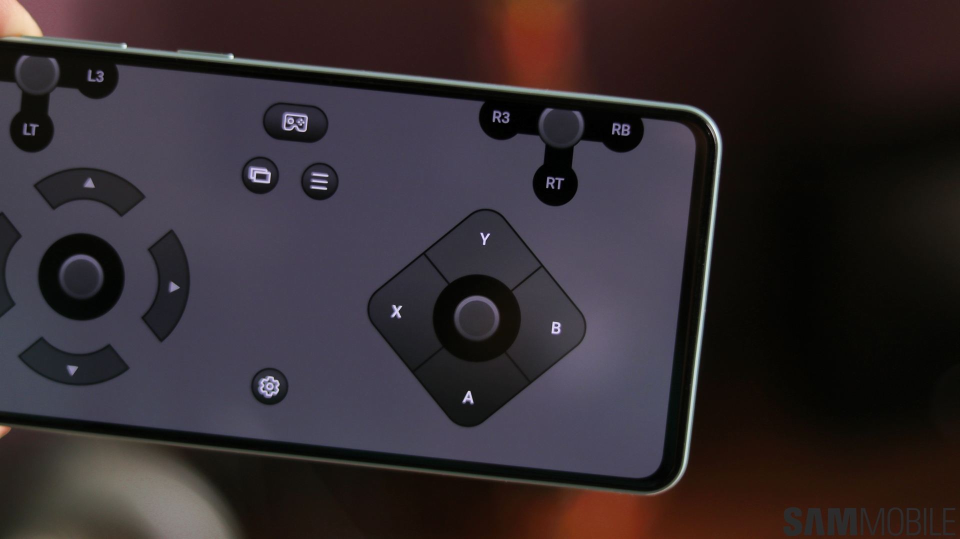
I tested Samsung’s Virtual Gamepad on my Galaxy S24+ and Neo QLED QN90C TV briefly, and the mobile app seems to work as intended for the most part. I don’t have complaints, except maybe that it’s a bit buggy when you try to customize the layout, and the thumbsticks become invisible. It could be by design, in which case, it’s a poor design choice.
More importantly, I wish the app had a few extra options, and I think having them would’ve led to a much better day one experience.
For a start, there is no option to revert the layout to its default setup. Your only option is to close the app and open it again. That’s not a big deal, but the app is also missing an option to save custom layouts. If you don’t get along with the default layout, you’ll have to customize it every time you open the app.
And finally, the app has no layout color options, and I think adding them would help usability in a practical sense. Virtual gamepads already don’t have the best tactile feedback. After all, you’re using a touchscreen to simulate physical buttons.
Toned-down or even translucent on-screen buttons are not an issue when you use on-screen controls for a game that runs on your phone. In fact, they’re likely the preferred option so as to not get in the way of the gameplay.
However, this is a different case. We’re talking about a gamepad alternative for your TV rather than an on-screen gamepad for your mobile game. Ideally, you won’t be looking at your phone when playing a game on your TV. But, due to the lack of tactile feedback, you may sometimes want to rely on your peripheral vision to locate buttons on your phone’s screen. And an all-gray layout doesn’t help locate the buttons at a glance.
I think giving users the option to color each button individually (or choose from color presets) could have improved the experience greatly. As it is now, the gray virtual thumbsticks and buttons don’t stand out enough. They’re not easy to make out when you are trying to focus on whatever is happening on your TV screen.
In all fairness, this app is new, and Samsung might already be thinking of ways to improve it. So we will give it time. But it could’ve been a lot better from day one if it had these few extra options. And I hope Samsung will consider adding them with future updates.
Join SamMobile social media channels to get instant Samsung news updates, device reviews, best deals, opinions, and more.
[ad_2]
Source Article Link


