[ad_1]
Some say it’s always better to have more options, but it’s never as clear-cut as it sounds. This design philosophy doesn’t always work, and more importantly, it isn’t a magical shortcut that can patch everything up and always lead to a better user experience. On the contrary, if not handled properly, I believe the “more is always better” approach can sometimes harm the UX and alienate customers.
Unfortunately, Galaxy phones and tablets, or the alliance between Android and One UI, make for a good example of a somewhat confusing experience. Don’t get me wrong, I believe One UI is fantastic, but it isn’t a full-fledged OS, even if it can sometimes give off that impression thanks to the included high-quality Samsung-made apps.
However, One UI sits on top of Android OS, which means it is bound to a portion of Google’s app ecosystem. This is where I believe things can get confusing for the average consumer.
Because of the Samsung-Google alliance, Galaxy phones and tablets ship with too many duplicate apps that essentially serve the same purpose. Some examples include:
- Two Messaging apps that share the same name.
- Two web browsers (Samsung Internet and Google Chrome).
- Two email apps (Samsung Email and Google Gmail).
- Two virtual assistants (Samsung Bixby and Google Assistant).
- Two app stores (Galaxy Store and Google Play).
- Two Gallery apps (Samsung Gallery and Google Photos).
- Two weather forecast systems.
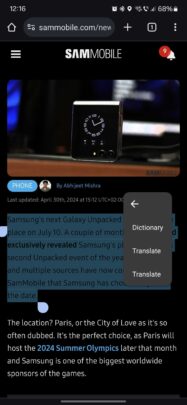
Worse yet, Google and Samsung can’t always design user experiences together, which can lead to similar features clashing. Take this screenshot of the Google Chrome translate feature in action as an example.
When Galaxy device users highlight text they want to translate in Chrome, they’re presented with a tooltip menu containing two “Translate” options. One is Samsung’s, and the other is Google’s, but there’s no way to tell them apart unless you select them or remember which is which from previous interactions.
This is a perfect example of too many options leading to an unfriendly user experience. To the end user, it makes little difference that Samsung likely has no power over Google Chrome’s tooltip menu. Google included that option, and users have to live with it.
As for the app situation, is there anything Samsung can do to make the user experience friendlier? Is there a solution to cleaning up One UI and offering a better-curated experience rather than throwing more options in the user’s lap?
Samsung can’t ditch Google apps but could better curate the experience
In an ideal world, Samsung would have created and perfected its own mobile OS for Galaxy devices, independent of Android OS and Google. But I’m afraid that’s an unrealistic scenario.
Likewise, I doubt Samsung can exclude Google’s apps from its devices, given the co-dependency between these two tech giants.
However, there might be a simpler solution to addressing the incoherent user experience, at least, to a degree. Samsung could rethink its Galaxy device setup process to allow users to choose their default apps from the get-go.
At the moment, there’s no such option. Upon setting up a new Galaxy device, users end up with a mix of Samsung, Google, and even Microsoft apps as the default solutions. And some average consumers might not even realize that they’re using an app provided by one or the other.
Story continues after the video…
It should be noted that an option to choose your default apps already exists, but it is only accessible after the initial Galaxy device setup process — not during. And not every brand-new Galaxy device user might know that they can open the Settings app on their Galaxy phones, navigate a couple of menus, and eventually access the “Choose default apps” option for a deeper layer of customization.
All things considered, the Galaxy phone and tablet experience will probably never be rid of the app duality problem. Default app options offered by both Samsung and Google will probably always clash on Galaxy phones and tablets. A solution to fewer but well-curated options doesn’t seem possible at present.
Nevertheless, maybe Samsung could mitigate the issue by redesigning the initial Galaxy device setup process with new users in mind. It could better inform users of the choices they can make and thus remove some of the confusion that permeates the relatively disjointed Samsung-Google experience.
[ad_2]
Source Article Link


