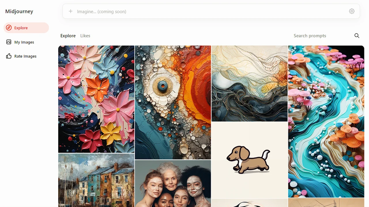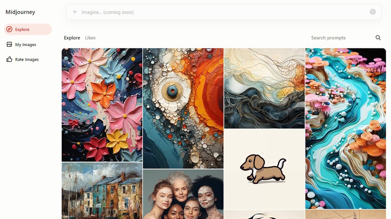
Midjourney, a key player in the digital world of AI art creation, has recently launched its new website providing users with a combination of AI and HTML in its user interface design. The revamped website, characterized by a minimalist design, offers improved image search capabilities, a redesigned community feed, and an innovative image rating system.
However, the removal of some features from the previous site has sparked discussion among its users. This quick overview guide will provide more insight into the new features that have been made available to users. You can check out the latest development release at the beta Midjourney website.
Clean user interface and design
The new website’s user interface is clean and breaks away from the traditional grid system, a departure from the cluttered interfaces of the past. The minimalist design, supported by HTML, enhances the navigation system, making it easier for users to find what they’re looking for. The image search capabilities have been significantly improved, leading to quicker search times and more accurate results. The community feed, a popular feature on the old site, has been reimagined as the Explore page, providing users a fresh way to discover new content.
Image rating system
Another notable feature of the new website is the image rating system. Users can now rate images and earn extra hours for their contributions. This system not only encourages user engagement but also fosters a sense of community among users. Additionally, the new website allows users to create images outside of Discord, a popular communication platform, giving users more flexibility and creative freedom.
New Midjourney website features
Other articles you may find of interest on the subject of the Midjourney AI art generator :
However, the new website has faced criticism, particularly for its lack of certain features. Users have expressed disappointment over the removal of specific tools such as selective image downloading, image origin tracing, parameter or user-based searching, and gallery sharing. The elimination of personalization features like banners and profile pictures has also been a point of contention among users. Furthermore, the new website lacks organizational tools and doesn’t allow users to delete images, limiting their control over their content.
The Alpha version of the new website included several features that didn’t make it to the final version. These features, tested during the alpha testing phase, were removed based on user feedback and technical considerations. The decision to focus on newer users has raised concerns about retaining long-term users. While the new website offers a streamlined user experience, it risks alienating long-term users who were familiar with the old site’s features and functionalities.
The new Midjourney website represents a significant step forward in design and technology. However, the removal of certain features has sparked debate among its users. As the website continues to evolve, it will be interesting to see how Midjourney addresses these concerns and balances the needs of new and long-term users. For now, users are encouraged to try out the new website and provide feedback, contributing to its ongoing development and refinement.
Filed Under: Guides, Top News
Latest timeswonderful Deals
Disclosure: Some of our articles include affiliate links. If you buy something through one of these links, timeswonderful may earn an affiliate commission. Learn about our Disclosure Policy.

